ADHD JOURNAL
Making your mind your superpower
The recreation of epic self's ADHD Planner as a website and corresponding mobile application, allowing for a journal that is more convenient, cost effective, and environmentally friendly.
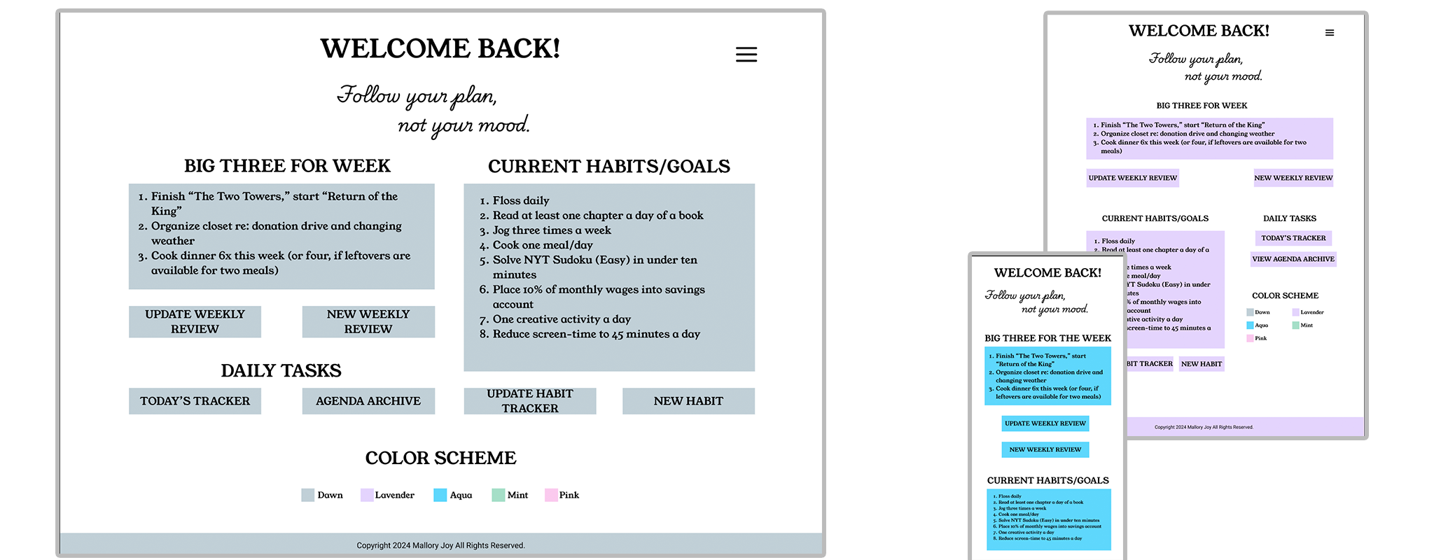
Overview
The ADHD Journal provides those with Attention Deficit Hyperactivity Disorder (or ADHD) an outlet to best track their goals, establish stronger habits, and prevent the dreaded burnout associated with intense sprints of hyperproductivity. This project aims to recreate an efficient journal (created by epic self) for digital use. In converting this journal into a website and mobile application, the user has a new opportunity to remain consistent. A common symptom of ADHD is forgetfulness, and the ease in which one could forget to bring a journal with them on a trip, or forget to fill it out entirely, is mitigated by the presence of an app attached to the device people carry with them at all times!
- Team: As this is a solo endeavor, I am the principal designer (though full credit for the concept is owed to epic self)
- Tools: Wireframes and mockups were sketched by hand, with final designs and prototypes being created using Figma.
- Project Length: This project spanned two months.
Exploration/Discovery
Most people with ADHD (including myself) have tried every journal, planner, and goal tracker available, hoping one will stick. Unfortunately, most prove inefficient after the hyperfocus phase ends. This journal was the first to keep me on target and focused on my goals for longer than six weeks. Thus, I knew creating an efficient journal was just a matter of converting their consistent design into a reusable template that could be accessed from a phone.
In addition, an inability to focus is a common symptom amongst those with ADHD. Thus, I knew this product would need to be easy to use, with minimal scrolling needed; too much scrolling could lead the user to think “Ugh, this is taking forever, I’ll come back to it later,” and later never comes.
Design Process
The physical journal is laid out for users to track up to ten habits, followed by a daily planner for up to ninety days, with a “Weekly Review” section bookending each week to rehash successes, failures, benchmarks, and ways to improve in the coming week. My initial task was to take the layout of the journal, and convert each section of “Habit Tracker,” “Weekly Review,” and “Daily Planner” into a desktop, mobile, and tablet friendly template.
Initial Sketches
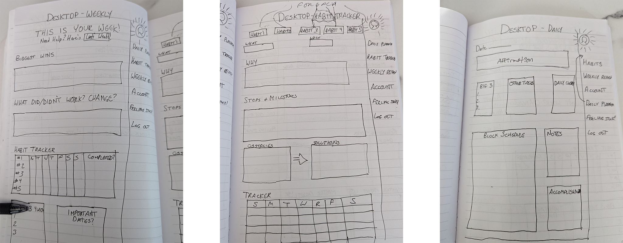
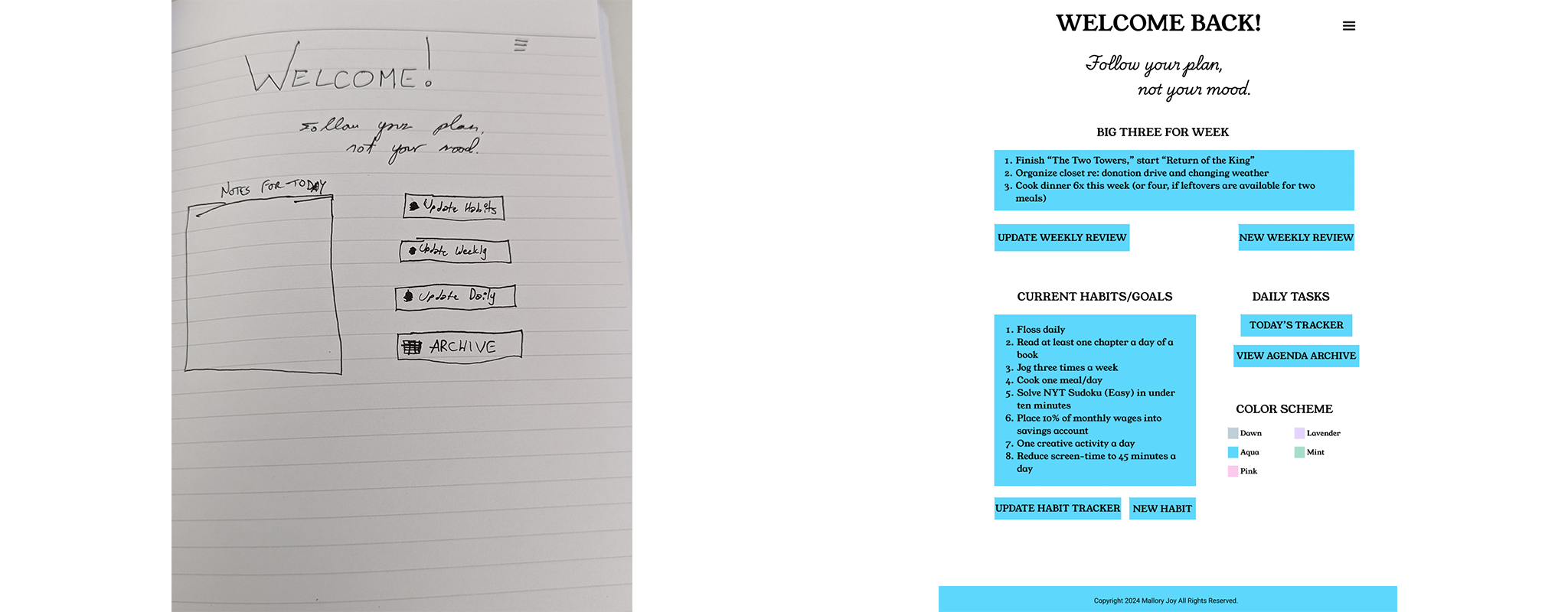
I decided to go with a more loose flow than the direct front-to-back, left-to-right nature of the journal. This flexibility would allow a user with a specific thought in their head, be it related to a habit being tracked or needing to consider a deadline, would be able to access the landing page and navigate directly to the space allotted for such a thought. Thus, a “landing page” was created as the first step in the flow, for a user to see the primary notes for their progress: the “Big three” tasks for the week, their current habits, and a way to either add a new day/weekly review/ habit to their account, or update their current pages.
The initial design for this page ended up vastly different to the finished design, based on visual symmetry and allotment screen space.
Landing Page Mockup vs. Actual Layout
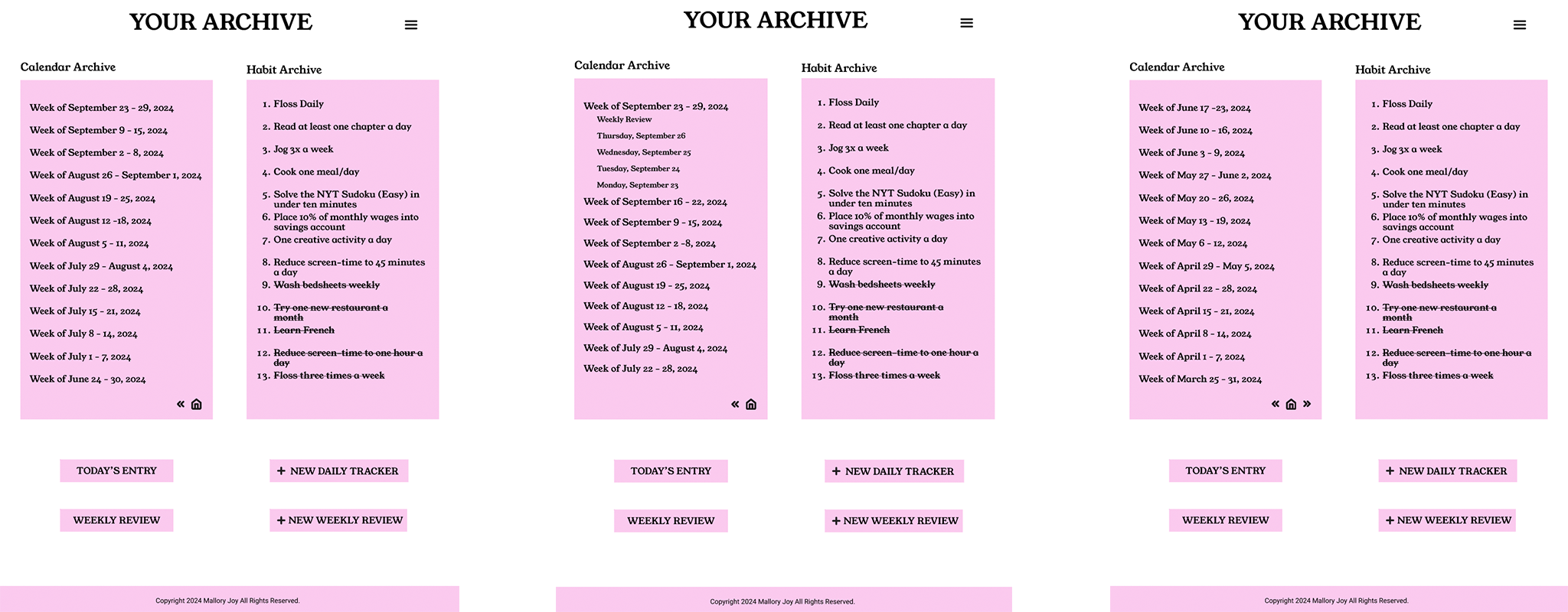
Journals as a whole act as an archive, allowing a user to reference previous entries with ease. I recreated this aspect for the digital product in creating an Archive page, in which a user can view previously tracked habits and weeks of entries, broken down by day.
Archive Page
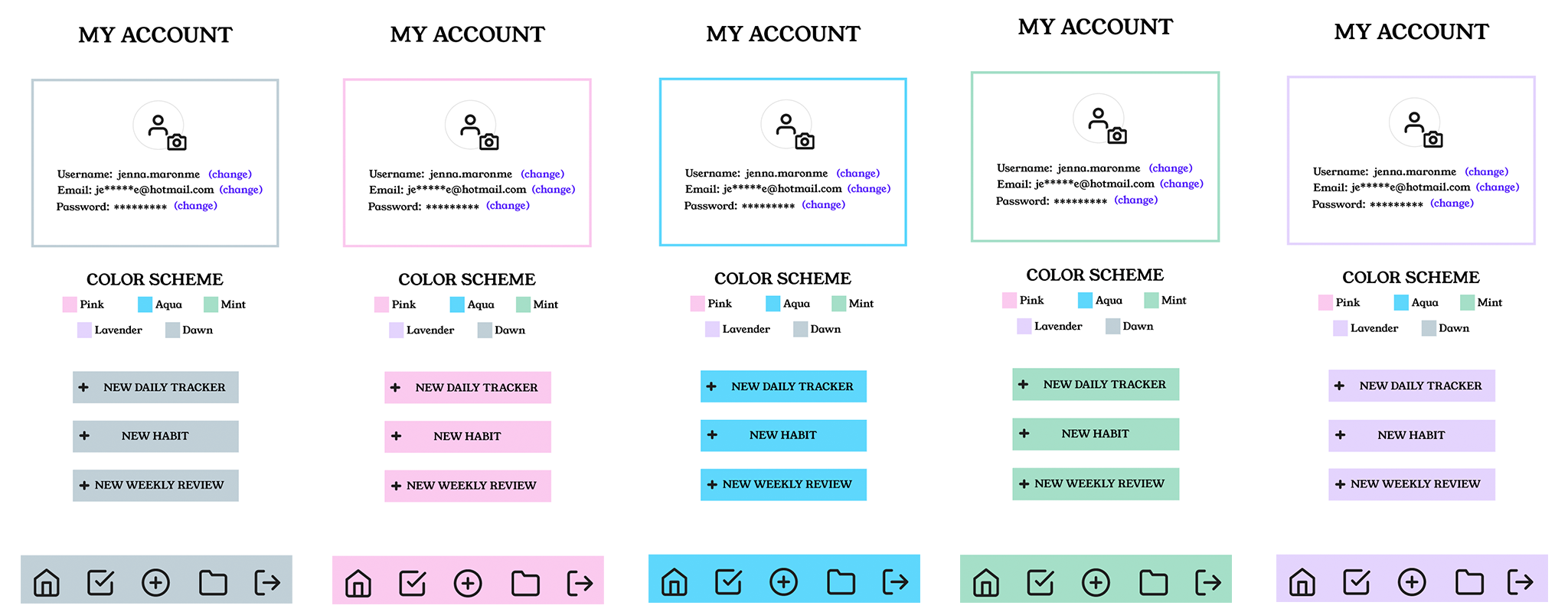
An additional aspect of the planner I chose to mirror in this project came in the form of color-coding. The journal is currently available in four colors, and I wanted users to be able to inject a similar level of personality into their journal. As a result, this application allows users to choose between five colors, with a blue-grey color as the default shade (specifically labeled “Dawn,” to symbolize a new day and a fresh start in every entry).
Color Options, seen in Account Pages in Mobile View
Throughout the build process, I consulted with a colleague for testing. This colleague helped to clarify several important accessibility points, such as ensuring readability across mobile sizes. Because ADHD (and digital opportunity as a whole) is not a one-size-fits-all system, creating a product that is easy to navigate and use across the board was of utmost importance.
Final Design
The final design for this product captures the efficiency of its source, and adds a new layer of convenience in its accessibility at all times. The overall minimalist nature of the design enables the user to feel less overwhelmed in maintaining the journal, as the major “fill in” spaces of the journal can all be completed in under ten minutes. As well, the ability to personalize the product with flexible color selection creates a personal touch, adding an additional sense of comfort for the user.
This product achieves a happy medium of dynamic design with simplicity, offering little frills and fantastic focus. By creating a product designed by an ADHD persona, for ADHD personas, I was able to hone in on what made the original product work, while also tweaking it for a modern, digital audience.
Final Considerations
Creating a productivity space for everyone to truly flourish can be done. Further iterations of this project as it moves from mock-up to launched product could include a synchronization to mobile phone operations, enabling a timed notification reminding users to update their journal program, without triggering Rejection Sensitivity Dysphoria. As conversations around mental wellness bloom, designers can retool products to best work for the mind of the user, making the mind of the user more powerful than a locomotive.